
At Your Modern Cottage, we believe that your “cottage” holds the promise of a place to recharge and disconnect. And Sherwin-Williams’ new Colormix Forecast 2020 speaks to us!
“Similar to Your Modern Cottage’s philosophy, our Colormix 2020 palettes are inspired around the concept of wellness,” says Sue Wadden, director of color marketing at Sherwin-Williams. “In today’s hectic world, each of the five palettes – Alive, Mantra, Play, Haven and Heart – represent a different aspect of mindful living in the quest to slow down and bring our best selves into the next decade. People are seeking warmth and have this desire to live mindfully, and that translates to color and how we’ll decorate our homes in 2020.”
The experts at Sherwin-Williams previewed the Colormix Forecast 2020 with designers earlier this summer, and the welcoming and intuitive palettes have them buzzing about a new decade in color. Below are reactions from some of their favorite pros.
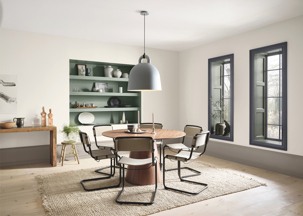
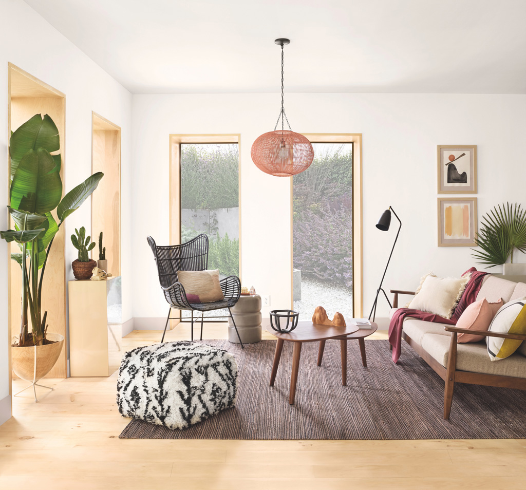
HAVEN
Jean Stoffer (Jean Stoffer Design): “The power of a neutral palette is something that can never be underestimated. Soft blue hues, shades of rich grey and a perfectly formulated pure white are timeless classics and essential staples in design. The collection of colors arranged within the Haven palette draw from the life around us and are snapshots of the calming influences of nature itself. There is a plentiful amount of beauty to find within the natural world, so when those same hues are draped within interior spaces, the comfort of nature resonates within its inhabitants.”
“The inclusion of live plants and psychologically proven calming color palettes are on trend at the moment and prove an interesting shift in dynamic within the design industry. If this mindset were to continue in the years to come, I am certain that the wellness movement will result in unprecedented growth and positivity within the home.”
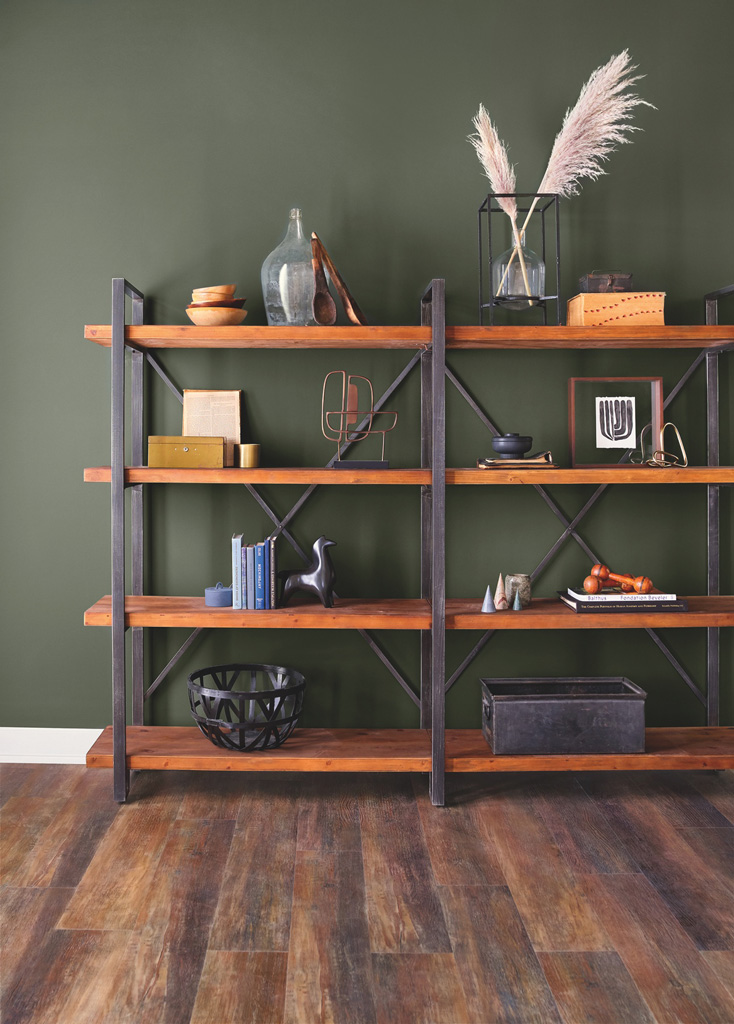
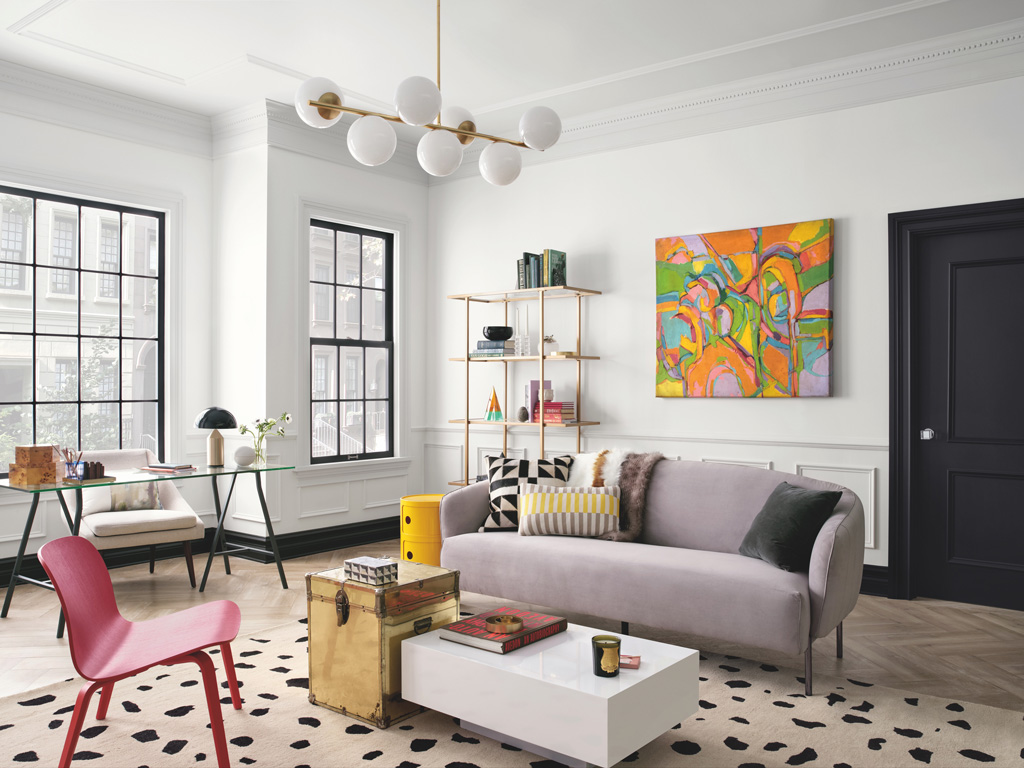
ALIVE
Latham Gordon and Cate Dunning (GordonDunning Interior Design): “We are particularly drawn to the Alive palette. We love the deep dive into colors’ impact and role in what’s happening in our world and culture. We are feeling a movement from the days of ‘the hustle’ to a balanced, better work ethic. The concepts of authenticity, intentionally taking in the present moment, and self-care are ideas that are influencing the way we work, our personal lives, and how we design for our clients.”
“We are using deep, rich colors that have an intense soothing quality to them more than in years past. We are going full force – painting every surface in a room navy blue or olive green. The choice gives the room purpose and a reserved intensity that we are relishing. It’s the equivalent of a thought-provoking novel that leaves you content vs. the beach read or intense thriller.”
MANTRA
Kim Lewis (Kim Lewis Designs): “Encouraging clients to use color is in my daily conversation. I have always said there is a psychology in colors, and how they evoke emotions in design. I love that the combination of colors in the Mantra palette take a cooler turn, sweeping through the paint deck like a breath of fresh air.”
HEART
Amber Clore (A.Clore Interiors): “The colors in the Heart palette are so calm and inviting, yet bold if and when they need to be. Realizing that when it comes to paint, sometimes it needs to be the star of the show, and other times it needs to fade to the background. This palette does that so naturally.”
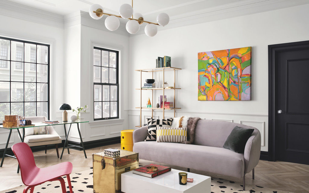
PLAY
Kelly Kole (Kandrac & Kole): “I naturally gravitate towards the Play palette because large, bold original art set on Pure White SW 7005 walls (one of my fave SW colors) is a standard combination in our designs. I also think that every room needs a touch of black (I prefer matte) and Caviar SW 6990 is perfect a perfect black with a tiny touch of brown.”

