
In Coffee and Tea, Jennifer delves into the mind of interior designer, Paul Sterczek. While sipping coffee and tea, Jennifer learns why and how a designer does what he does through discussions of process, techniques, and tools of the trade.
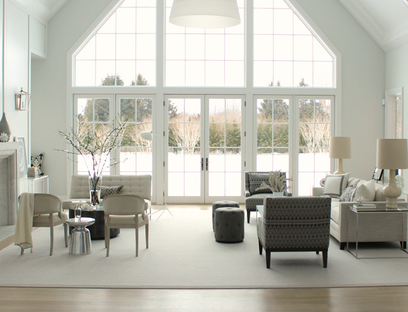
I thought I liked color in a home, or at least “pops” of color. Yet, I’m drawn to Paul Sterczek’s “Watermill” project. And, I’m not alone. “Everybody loves Watermill,” Paul says. “The main reason is the home’s calming palette.”
The Challenge
Ironically, figuring out the palette was what posed an immediate design challenge. The client did not want any color. So, Paul chose one hundred shades of grey, linen and white. “I was hesitant to add the barely black, charcoal chairs, but the room needed to have some sort of an anchor to pull us in. The chairs help ground the room and give it a little bit of diversity,” he says.
While the palette is cool, there’s nothing icy cold about it. And, even though it’s a summer house — just a half mile from the beach in the Hamptons — the palette needed to work year-round. It’s fresh with light colored upholstery and paneling painted Benjamin Moore “01 White” or also called “OC 151,” a classic white without any yellow or grey in it. Additionally, the rest of the room is painted Benjamin Moore Paper White, which Paul highly recommends. Pair it with Benjamin Moore 01 trim to make it pop!
Small Details Make Things Interesting
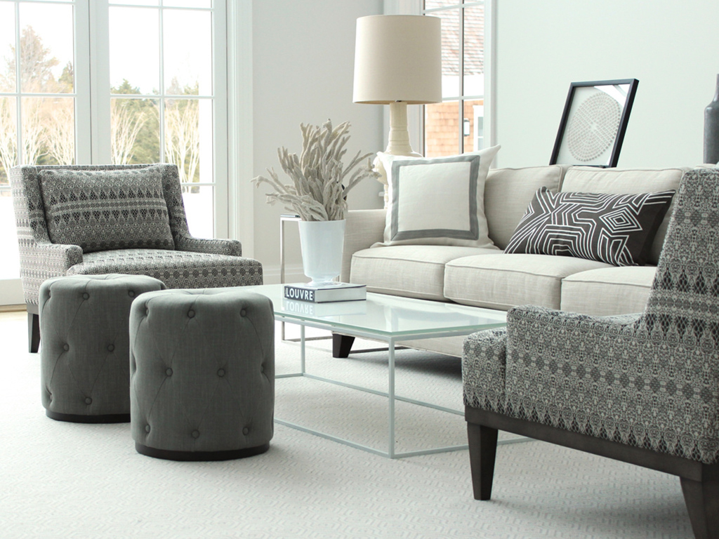
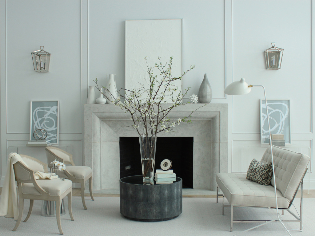
Textures in terms of glass, metal and fabrics make this simple palette interesting. For example, the lamps have a crackle finish, contrasting nicely a top a smooth finish. It’s hard to tell, but the modern, round table in front of the fireplace is faux shagreen with an antique mirrored top. In addition, pillows and throws make the space warm and welcoming, while hard-edged items such as the coffee and side tables counter the room’s overall softness. Do you see the pillow peeking out of the lefthand corner? That’s a cozy, window seat!
Modern and Tradition Meet
Since the wife’s taste is modern and the husband leans traditional, Paul included elements that could mix decor styles. Open back, barrel back chairs situated by the fireplace open up the space to not being strictly modern. They are a clean version of a Swedish antique chair. The lanterns on the wall are simple – polished nickel with both a clean finish and lines. Other upholstered pieces are vaguely traditional, while the modern pieces are classic designs referencing Knoll. The floor lamp is Serge Mouille.
Unify the Seating Areas
“Everything sits on the rug, which is a big thing for me,” Paul says. The rug brings the two seating areas together, so that it feels as one unit. It’s done with a simple, basic broadloom by Milliken. He said that they offer a very accessible customization program. A great way to get a luxurious look, at a good price point — a fraction of what a custom rug would be. “You just roll it out, and it looks great,” he says. “Plus, it’s very cleanable!” The feeling of the room would change if the rugs weren’t big enough or if there were multiple rugs.
The Fixture is HUGE
While Paul loves the windows and big, open room, everything felt small once placed in there. A HUGE fixture centered in the middle of the room brings the ceiling down, giving new height to the seating area. With a clean, modern fixture hanging down, the living room furniture seems a little less dollhouse-like. It also joins the two seating areas, just like the rug does.
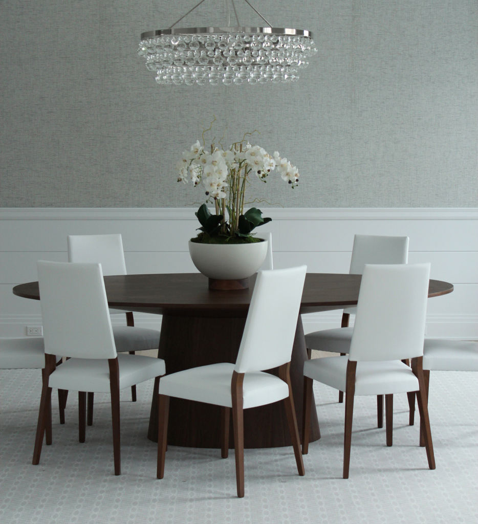
You Can Do White!
While kids weren’t a consideration for this design project, this light palette could still have worked. I was shocked when Paul said, “You could have a chocolate sundae party in the dining room!” Ummm…really? Yep, he said that the chairs are faux leather vinyl (pleather). They look really slick, but you can easily wipe them clean. The settee grouped with the barrel back chairs is also pleather. Basically, yes, you can have a white or light room, if you choose the right materials.
Interior Design & Photography: Paul Sterczek Interior Design
![]()

Thanks for the Coffee & Tea with me! It was a pleasure talking about the process with you.