
Summer is here! And while you’re enjoying beautiful, lazy days in the sun, it’s also a good time to freshen up a room or two with a new coat of paint. But, what color? We made the rounds, asking the color experts at Behr, Benjamin Moore, and Sherwin-Williams what paint is hot this summer. Valspar will be included in Part Two of our Series on Paint Colors.
Yellows & Golds
According to Erika Woelfel, VP of Color and Creative Services at Behr Paint, her and her team of color experts are seeing a number of color stories rising to the top for summer 2019.
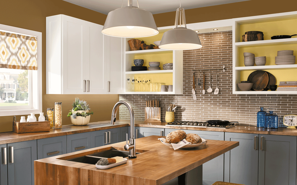
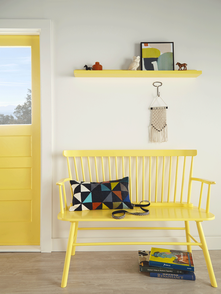
“Inside, we see homeowners gravitating toward playful, optimistic yellows and golds, such as Spirited Yellow or Amber Autumn. Shades of yellow have risen to popularity because they add a strong sense of energy and positivity,” she says. “Yellow also represents vitality and ambition, traits we’re seeing in this upcoming generation of tastemakers.”
Benjamin Moore Color & Design Expert, Hannah Yeo, suggests yellows such as Hawthorne Yellow HC-4 or Pale Moon OC-108.
Behr’s Spirited Yellow
Pink
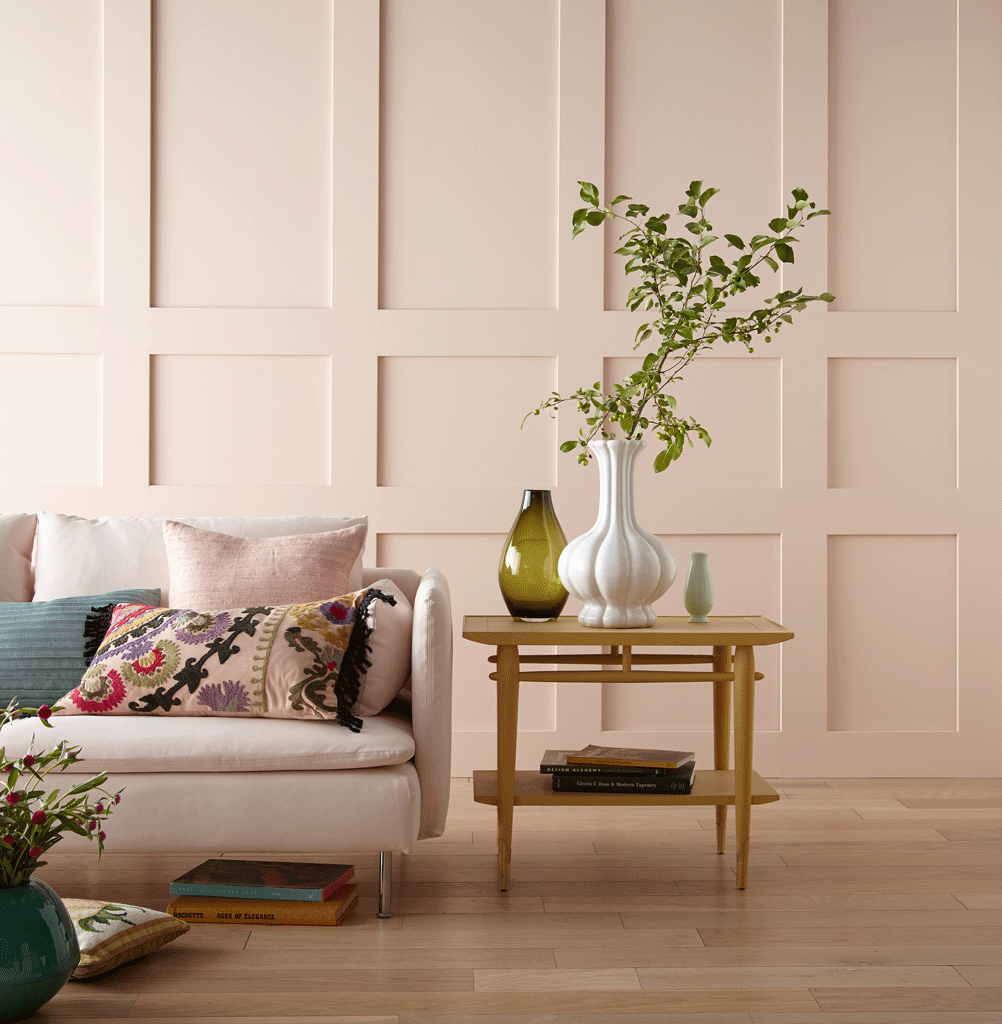
In addition, Benjamin Moore’s Pleasant Pink 2094-60 can rejuvenate any space this time of the year, notes Yeo.
“Charming Pink SW 6309 offers a lot of versatility and can be used just about anywhere in the home—kitchens, bathrooms, bedrooms and more,” says Sue Wadden, Sherwin-Williams Director of Color Marketing.
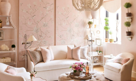
Behr’s Woelfel agrees, “Pink is also a trending color for interior paint—it’s a bright and upbeat hue for summertime that will also remain cheerful and trendy throughout every season. Customers may be gravitating toward this hue as an optimistic choice, symbolic of positivity and passion. I love that people are embracing this confident shade. Using strategically-placed pops of pink on your walls can certainly infuse new energy into your home. I’m especially loving Sand Dance from the BEHR 2019 Color Trends palette.”
Sand Dance from the BEHR 2019 Color Trends palette
Blues and Greens
“Blues and greens are also really good colors for summer,” says Woelfel. “For example, mints like Brook Green or sea foam like Moon Glass as a refreshing option. These hues from Behr are cool and relaxed, making them perfect for the warm season.”
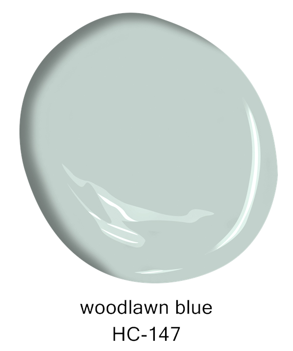
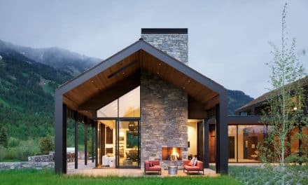
Yeo also suggests cooler hues such as Benjamin Moore’s Woodlawn Blue HC-147 and Hunter Green 2041-10. These colors complement the scenery outside, blurring the line between indoor and outdoor.
Comforting Colors
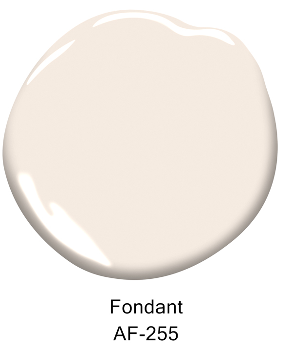
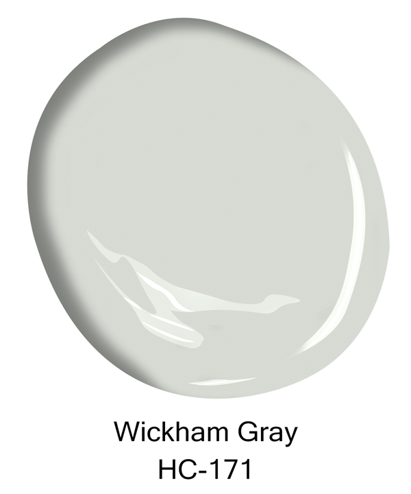
“As wellness and sustainability become a key focus across design industries, the colors for this season are inspired by lifestyle trends that evoke comfort, harmony and balance,” says Yeo. “The soothing Pale Oak OC-20, Fondant AF-255 and Wickham Gray HC-171 are popular choices for the interiors. The soft nuances of these colors are just enough to make a subtle statement but not overpowering the space.”
Warmer Colors
“Warmer colors are trending for the home, which pairs perfectly with the heat of summertime,” says Wadden. “Sherwin Williams Cavern Clay SW 7701 is a warm terracotta that brings the outdoors in by evoking beaches, canyons and sun-washed summer afternoons.”
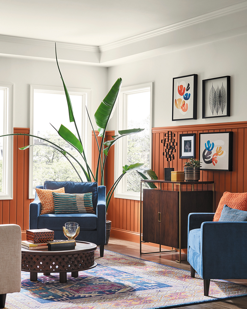
Sherwin Williams Cavern Clay SW 7701
“Warmer neutrals, like Shiitake SW 9173, paired with grey are a great choice for summer cottages, as well,” continues Wadden.
“Our new Color ID palette, Dreamer, was inspired by California Casual Coastal living. Think: sea, sand, sky and coral. This entire palette of 16 colors is a perfect choice for cottage living.”
Up Next: Part Two of Our Series – Bright and Bold
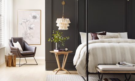
Top Photo: Behr Spirited Yellow and Amber Autumn
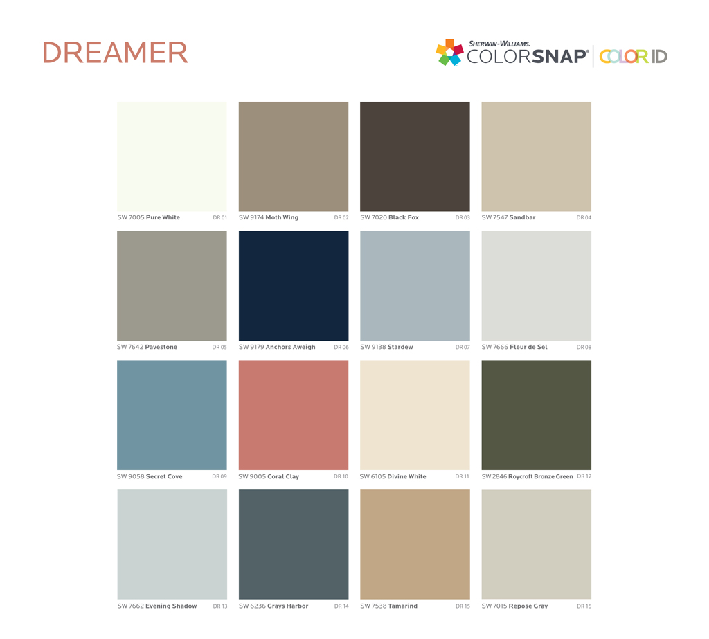
Sherwin Williams’ Dreamer palette features primarily neutrals, accented by inspiring pinks and blues
