A Thoughtful Renovation: Phinney Mini
Our winning cottage in the Additions and Renovations category in our 2023 Your Modern Cottage Design Awards Competition is Phinney Mini by Best Practice. This category celebrates modern cottages that have been specifically altered, adapted, and renovated for the families living within them.
Surrounded by old-growth trees in Seattle’s Phinney Ridge neighborhood, Phinney Mini is a compact cottage that demonstrates how older homes can be adapted for the modern day.
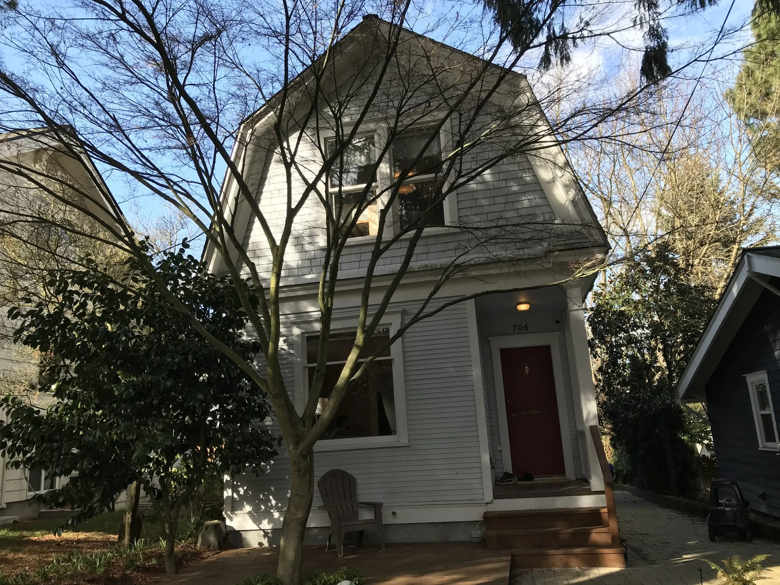
When a young family outgrew their beloved 1,665-square-foot, 1907 cottage with two bedrooms and one bath, they entrusted Best Practice to reimagine the 16-and-a-half-foot-wide two-story home as a functional, contemporary, and exquisitely detailed living space. They loved their house and the neighborhood, so they didn't want to relocate. Plus, they preferred not to tear it down and start from scratch. To them, there was something really wonderful about their home.
Renovation: Quality Over Scale
One of the guiding principles of this project for the homeowners was quality over scale. Having spent their respective childhoods in Maui and Japan, they made it clear that they valued thoughtful, well-organized spaces with a natural palette. As a result, every inch of the home is purposeful, thought through, and meticulously finished.
They tasked Best Practice to modernize the kitchen, design a new family bathroom with a traditional Japanese soaking tub, provide additional living space, and improve connections to the lush backyard.
And the architects did just that, transforming the home’s layout from a series of compartmentalized rooms into an open living space, using smart, strategic design decisions and only a 30-square-foot micro addition (housing the requested soaking tub) to accommodate the family’s priorities.
The selected interior finishes favor sustainable materials and textiles, high recycled content, and low VOC for improved indoor air quality.
Before Images (Kitchen and Bathroom)
Better Use of Space
"We always try to look for what we can leverage," says Kip Katich, partner with Best Practice. "We find that homeowners have the space, but need to find a way to use it better."
He notes that there was discussion about how to make the one bathroom with two kids livable for the long term. With a small lot and zoning regulations, there was little that they could do. So the solution was to shrink the kitchen to make the bathroom a little more generous. And the toilet became its own room to allow for more efficient use of facilities.
"The biggest challenge was figuring out how they would use the space and getting down to every detail, from arranging furniture to storing things, and daily use of the kitchen, to be sure that the design would work for them," says Katich.
Small Space Feels Large
"The Phinney Mini project does a fantastic job of making a small space feel large, and successfully doubles the life of this century-plus old house," notes one of the three judges of the competition, Joe Herrin, AIA, principal of HeliotropeArchitects. "The unusual program requirement for a Japanese-style bath is incorporated in a way that minimizes its impact on the overall layout, while giving the home a unique identity. Interiors are tightly detailed, with plenty of thoughtful moments, making the most of limited available space."
Brian Korte, FAIA, Principal, of Clayton Korte, also a judge, offered the same sentiments, "This is a very well-considered project all around. I really appreciated the level of thought that went into considering straightforward details and level of craft in all areas, maximizing design and function with limited space. Finishes have a simple elegance, are rich yet approachable, and play very well with interiors and furnishings."
A Remote Office
Since the project took place during the pandemic, it spurred the small, remote office in the backyard. The homeowner, like many, now had to work from home. However, there was no room to fit the office inside the home. But placing it outside actually had a benefit since there was a sense of leaving the house for work.
"On such a small lot with small yard, adding such a large structure could have taken away the beauty of the yard and usable space," says Katich. "But the homeowners were mindful of their neighbors and wanted to be thoughtful of its height and scale. So we took their concerns, which led to placing it three feet down with a planted roof."
"This home reflects a work/life balance and what it means to be at home," continues Katich. "It’s also about thinking urbanistically, environmentally, and how do we preserve these homes. How do we give them new life without having to push the boundaries of adding square footage for no really big gain as opposed to discarding them and starting new?"
Before Exterior Image (above)
For more winning home designs from Your Modern Cottage's Design Awards competition, read here.
Architectural Credit:Best Practice
Contractor: Kable Design Build
Photography: Rafael Soldi


